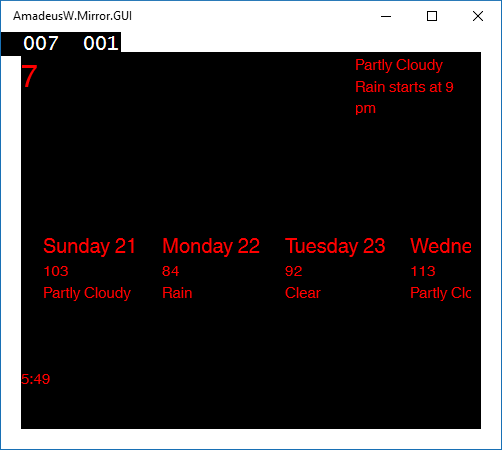
Working on the user interface can take disproportionate amount of time. I usually do the logic work first, and UI last, in the spare time. In the smart mirror project the UI is very bare bones: it’s only here to test data bindings. Let’s improve the looks of it.
Table of contents:
- Use the dark theme
- Put styles in their own file
- Style (almost) all TextBlocks
- Style specific TextBlocks
- Modify the default theme
- Changing theme at runtime
- Conditionally display UI elements
Watch this in a video instead
I wrote this blog post in preparation and after shooting a video about XAML. You can watch me go through these steps:
 Smart Mirror episode 12 - XAML and theming
Use the dark theme
The biggest bang for the buck for the smart mirror project is to request a dark theme. In App.xaml:
<Application
    RequestedTheme="Light">
change this into
<Application
    RequestedTheme="Dark">
Drastically changes the appearance of the app:
Put styles in their own file
It’s a good practice to keep related code together and unrelated code separately. We will leave the viewmodels in the main App.xaml and move style-related code to its own file.
Create a new Resource Dictionary (right click on a project, Add New Item > XAML > Resource Dictionary). If you call it MyApp.xaml and put it in Themes, use the following code in App.xaml: Add <ResourceDictionary.MergedDictionaries> where you will specify the path to the new dictionary.
<Application>
  <Application.Resources>
    <ResourceDictionary>
      <ResourceDictionary.MergedDictionaries>
        <ResourceDictionary Source="Themes/MyApp.xaml" />
      </ResourceDictionary.MergedDictionaries>
Important notice: If you had some resources stored directly in <Application.Resources> before, now you need to move all resources into the <ResourceDictionary>.
Style (almost) all TextBlocks
Let’s try to theme all instances of TextBlock. To do this, create a Style with TargetType but without the Key. You can put it either into ResourceDictionary in App.xaml or MyApp.xaml
<ResourceDictionary>
  <SolidColorBrush x:Key="TextColor" Color="#FFFF0000" />
  <Style TargetType="TextBlock">
    <Setter Property="FontFamily" Value="Helvetica World" />
    <Setter Property="FontSize" Value="20" />
    <Setter Property="Foreground" Value="{StaticResource TextColor}" />
  </Style>
This works for free-standing TextBlocks, but not for these embedded in a template, e.g. DataTemplate
Style specific TextBlocks
To style absolutely all instances of TextBlock, we need to set each one’s Style property. It’s unfortunate that it requires much more code changes and it’s not as elegant as CSS tag selector. Let’s take advantage of this, though, and create different styles for different TextBlocks. XAML styles implement inheritance with BasedOn property:
<ResourceDictionary>
  <Style x:Key="MyText" TargetType="TextBlock">
    <Setter Property="FontFamily" Value="Helvetica World" />
    <Setter Property="Foreground" Value="{StaticResource TextColor}" />
  </Style>
  <Style x:Key="LargeText" BasedOn="{StaticResource MyText}" TargetType="TextBlock">
    <Setter Property="FontSize" Value="20" />
  </Style>
  <Style x:Key="VeryLargeText" BasedOn="{StaticResource MyText}" TargetType="TextBlock">
      <Setter Property="FontSize" Value="30" />
  </Style>
To use these styles, assign appropriate StaticResource to element’s Style. Here we’re using all three styles for various TextBlocks:
<TextBlock Style="{StaticResource MyText}" />
<TextBlock Style="{StaticResource LargeText}" />
<TextBlock Style="{StaticResource VeryLargeText}" />
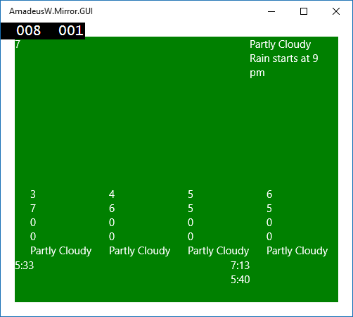
Modify the default theme
We can also override the resources used by the default theme. Unfortunately, we can’t set the color of TextBlocks (their color is hard-coded rather than provided by another resource).
For the sake of showing an example, we will modify application’s background which is provided by a SolidColorBrush with Key="ApplicationPageBackgroundThemeBrush". All we need to do is create a new resource with the same Key as resources found in the base theme, and put it in correct hierarchy of resources. Specifically, we put the resource in ResourceDictionary which
- Is inside
<ResourceDictionary.ThemeDictionaries>- this tells XAML that we want to override resources that make up one of the three base themes:Light,DarkorHighContrast - Has the key
"Default"for the dark theme,"Light"for the light theme, and"HighContrast"for the high contrast theme.
<Application>
  <Application.Resources>
    <ResourceDictionary>
      <ResourceDictionary.ThemeDictionaries>
        <ResourceDictionary x:Key="Default">
          <SolidColorBrush x:Key="ApplicationPageBackgroundThemeBrush" Color="Green" />
        </ResourceDictionary>
      </ResourceDictionary.ThemeDictionaries>
How did I know to change ApplicationPageBackgroundThemeBrush?
The base themes are available for your reference in generic.xaml and themeresources.xaml in C:\Program Files (x86)\Windows Kits\10\DesignTime\CommonConfiguration\Neutral\UAP\10.0.10586.0\Generic (the version number might be different)
Explore these files to find resources that base styles depend on. You can change them to easily theme large chunks of your app.
Changing theme at runtime
Think again if you really want to do it. There is no nice solution
I would like the theme of the app to use a red color at night. In Universal Windows Apps there is no DynamicResource, so changing properties of resources is not as elegant as in regular Win32 app. If you want to look at all failed attempts to get it working, here is my SO question.
The following options don’t work in Universal Windows App:
- Using
DynamicResource
- This type is no longer used, for performance reasons
- Changing a dictionary at runtime
- As demonstrated in Dynamically Skinning Your Windows 8 App
- Using an Effect to change colors
Effectsare also removed fromUIElements
Here’s what you can do:
- Change element’s
Style
- To enumerate all elements, use this code
- Change the element’s theme
- As there are only Light and Dark themes, you don’t have much flexibility.
We will change the theme of the Frame that contains the entirety of the user interface. For the complete solution, read this SO answer. In brief:
- Create and use
ThemeAwareFramethat inherits fromFrame(code is in the SO answer)
// App.OnLaunched
  rootFrame = new ThemeAwareFrame(ElementTheme.Dark);
- Create your resource in both Light and Dark themes
<ResourceDictionary
  <ResourceDictionary.ThemeDictionaries>
    <ResourceDictionary x:Key="Dark">
      <SolidColorBrush x:Key="MyTextColor" Color="#FFFFDD99" />
    </ResourceDictionary>
    <ResourceDictionary x:Key="Light">
      <SolidColorBrush x:Key="MyTextColor" Color="#FFDDEEFF" />
    </ResourceDictionary>
  </ResourceDictionary.ThemeDictionaries>
  <Style x:Key="MyText" TargetType="TextBlock">
    <Setter Property="Foreground" Value="{ThemeResource MyTextColor}" />
  </Style>
- Change the
AppThemeof the instance ofThemeAwareTheme. In this example, we’re callingTimeOfDayChangedHandlerevery second with alternating boolean flag.
private void TimeOfDayChangedHandler(bool nightFall)
{
  (Window.Current.Content as ThemeAwareFrame).AppTheme = nightFall ? ElementTheme.Dark : ElementTheme.Light;
}
Here’s the result:
So far so good. This is the first time I was able to change anything on the screen! Now we need to overwrite the light theme such that it looks like the dark theme. Notice that this will force users of your app to use the dark theme, despite their personalized system settings. This will also force you to stick to one theme, as the other one will be sacrificed for the effect.
- Go to
C:\Program Files (x86)\Windows Kits\10\DesignTime\CommonConfiguration\Neutral\UAP\10.0.10586.0\Generic\themeresources.xaml - Copy it into a new dictionary in your solution:
Themes/LightOverride.xaml - Remove all nodes except for
<ResourceDictionary x:Key="Default">(dark theme) - Rename this node to
<ResourceDictionary x:Key="Light">(make it the light theme) - Merge this dictionary in App.xaml
<Application>
  <Application.Resources>
    <ResourceDictionary>
      <ResourceDictionary.MergedDictionaries>
        <ResourceDictionary Source="Themes/MyApp.xaml" />
        <ResourceDictionary Source="Themes/LightOverride.xaml" />
      </ResourceDictionary.MergedDictionaries>
Now, we are done. Notice the letters change from light blue to light yellow.
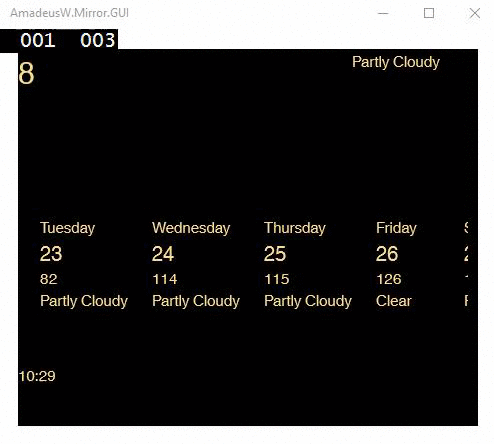
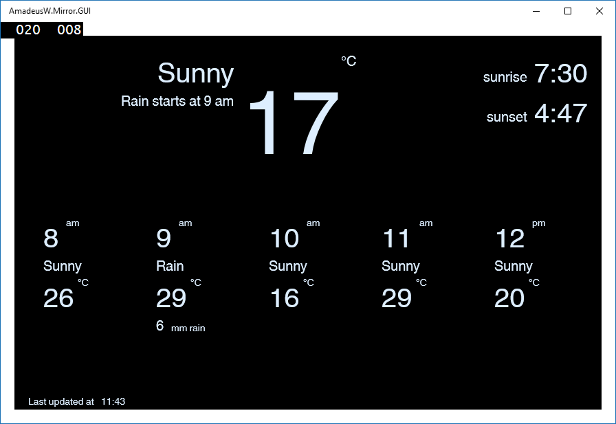
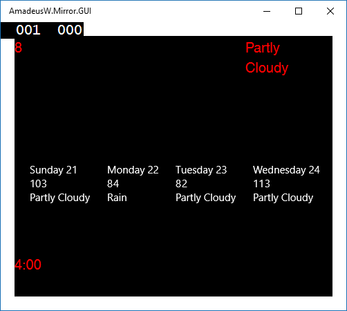
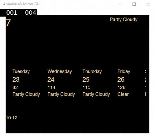
Conditionally display UI elements
When displaying weather forecast, I don’t want to show “0mm rain” on each sunny day. We can use a converter to hide this text.
Create a class NonZeroValueToVisibilityConverter in namespace My.App.Converters, add it to the dictionary in the following way:
<ResourceDictionary
  xmlns:converters="using:My.App.Converters">

  <converters:NonZeroValueToVisibilityConverter x:Key="NonZeroValueToVisibilityConverter" />
And use it in the following way:
<StackPanel Orientation="Horizontal" Visibility="{Binding Path=Rainfall, Converter={StaticResource NonZeroValueToVisibilityConverter}}">
    <TextBlock Text="{Binding Path=Rainfall}" />
    <TextBlock Margin="10 0 0 0" Text="mm rain" />
</StackPanel>
This screenshot was taken halfway through UI redesign. The rain and snow quantities are shown only when they’re non-zero.