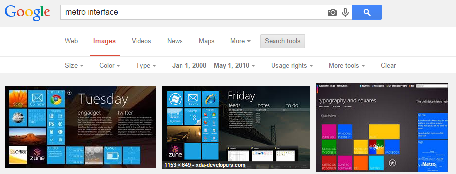
A few years before the Metro interface reached broader audiences through Windows Phone and Windows 8, Microsoft pioneered the Metro interface in the Zune app. The early versions of Metro, especially the one seen in Zune, was focused on typography. Currently, “metro interface” is associated with colorful, rectangular tiles:
Recreating the effect
I enjoyed the way Zune software looked and felt, and I wanted to create similar effect on my website
I liked the animation most when navigation flies in form one direction and the article flies in from another direction. The bottom half of the navigation, flies in from a little bit further source, and appears to be faster. Additionally, each of the navigation elements’ animation is delayed relatively to the previous element.
Code explained
The origin and destination of movement are controlled by paddingLeft and paddingRight CSS properties. Fading is accomplished using the opacity property.
The first part of javascript selects the header, and sets up its animation to full opacity and 20px to the right.
  $( "#"+id+" > header" ).stop()
    .css({
      'paddingLeft': '20px',
      'opacity': '0'
    })
    .animate({
      'paddingLeft': '40px',
      'opacity': '1'
    }, 'slow');
The second part selects the navigation bar below the header and sets up its animation 30px to the right.
  $( "#"+id+" > nav" ).stop()
    .css({
      'paddingLeft': '10px',
    })
    .animate({
      'paddingLeft': '40px',
    }, 'slow')
    /* continued: */
The code then continues to find each contained navigation element and individually animates it to full opacity and adding extra 10px of movement. Navigation elements are dound using each method, and animation delay increases for consecutive elements.
    .find( "li" ).each(function(childId) {
      $(this).stop().css({
        'opacity': '0',
        'margin-right': '20px'
      })
      .delay(100 + childId*200)
      .animate({
        'opacity': '1',
        'margin-right': '30px'
      }, 'slow');
    });
Final note on UX
@Honzie helped me improve the fly-in animation for the article content: he pointed me to Google’s Material Design which reminds that everything that moves should move for a reason, in order to mimic a physical object.
Hence, navigation left causes the article to fly in from the left side, and navigation right causes the article to fly in from the right side.
The origin and destination of animation are similarly controlled by paddingLeft and paddingRight CSS properties. newSectionId and lastSectionId are global variables that control direction of animation, and they are set in methods that handle link clicks.
var initialPaddingLeft = '30px';
var initialPaddingRight = '20px';
if (newSectionId > lastSectionId)
{
  initialPaddingLeft = '50px';
  initialPaddingRight = '0px';
}
When changing articles (this causes the header to fly in from the left), newSectionId and lastSectionId are both equal to 0 and therefore the content flies in from the right.
$( "#" + id ).stop().show()
  .css({
    'paddingLeft': initialPaddingLeft,
    'paddingRight': initialPaddingRight,
     'opacity': '0'})
  .animate({
    'paddingLeft': '40px',
    'paddingRight': '10px',
    'opacity': '1'
  }, 'slow');
Check out the final result on my portfolio or browse its source on github